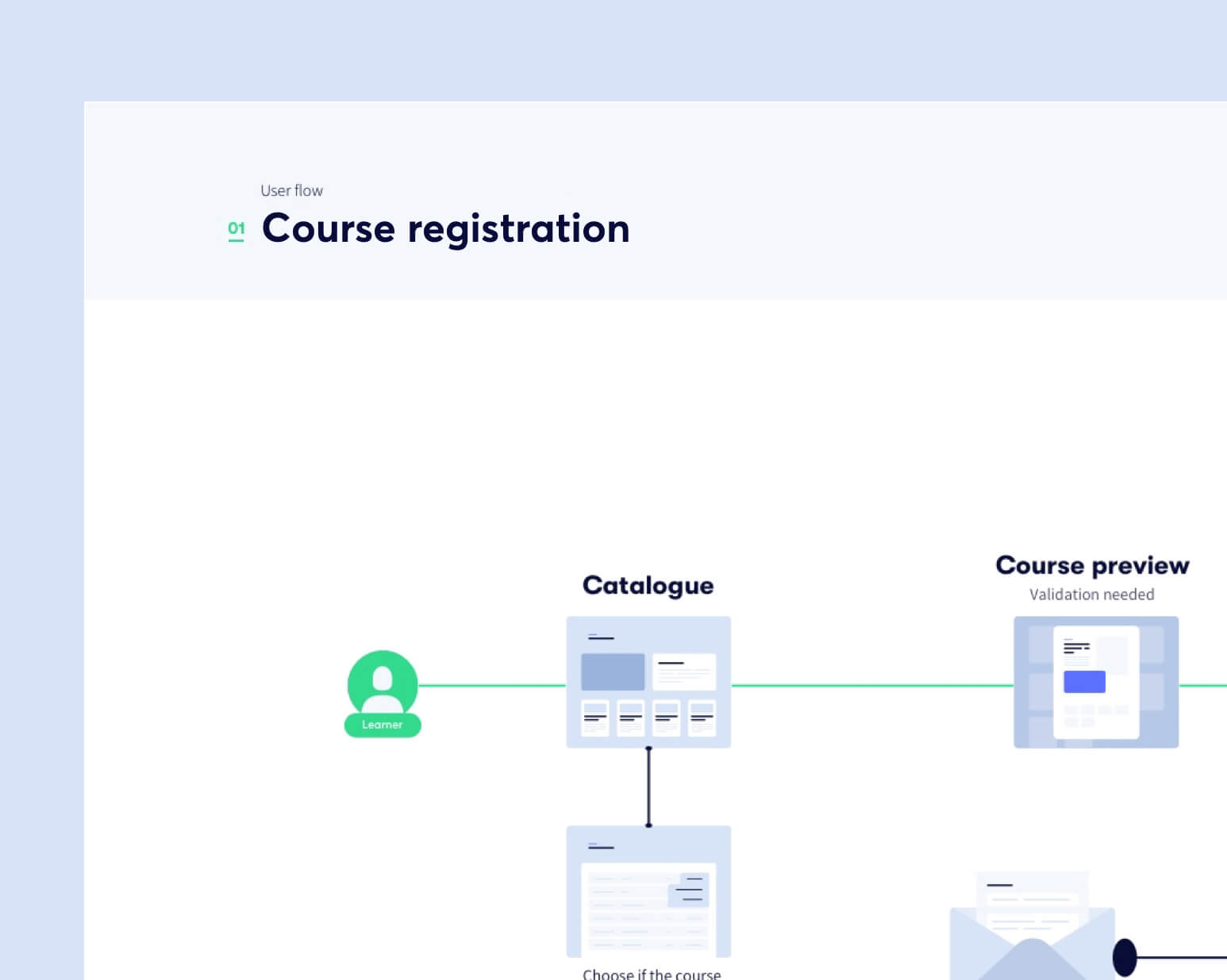
Product Sitemap
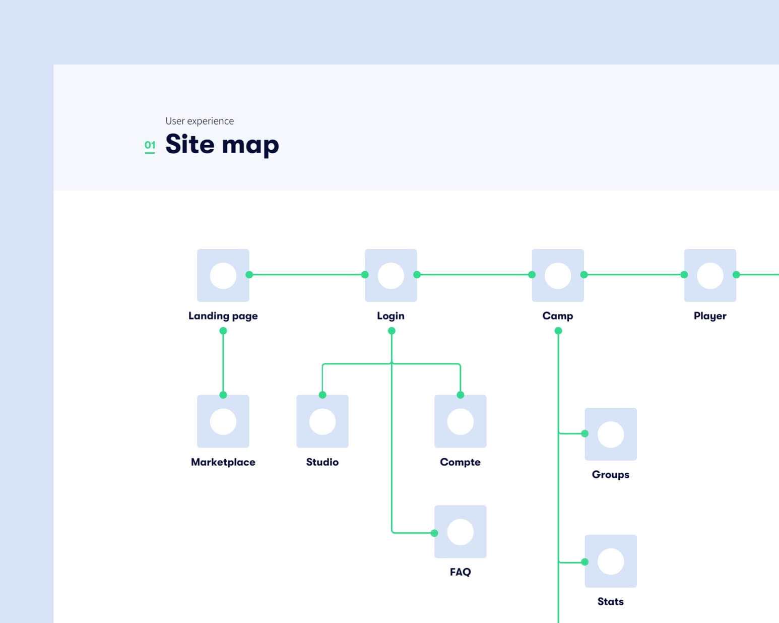
Working on a product sitemap allowed me to understand the goal of every page, which actions were linked and the most common way to perform an action.
MySkillCamp is a B2B learning platform that helps companies manage and train their employees. I was contacted by MySkillCamp to work on the redesigning of their platform.
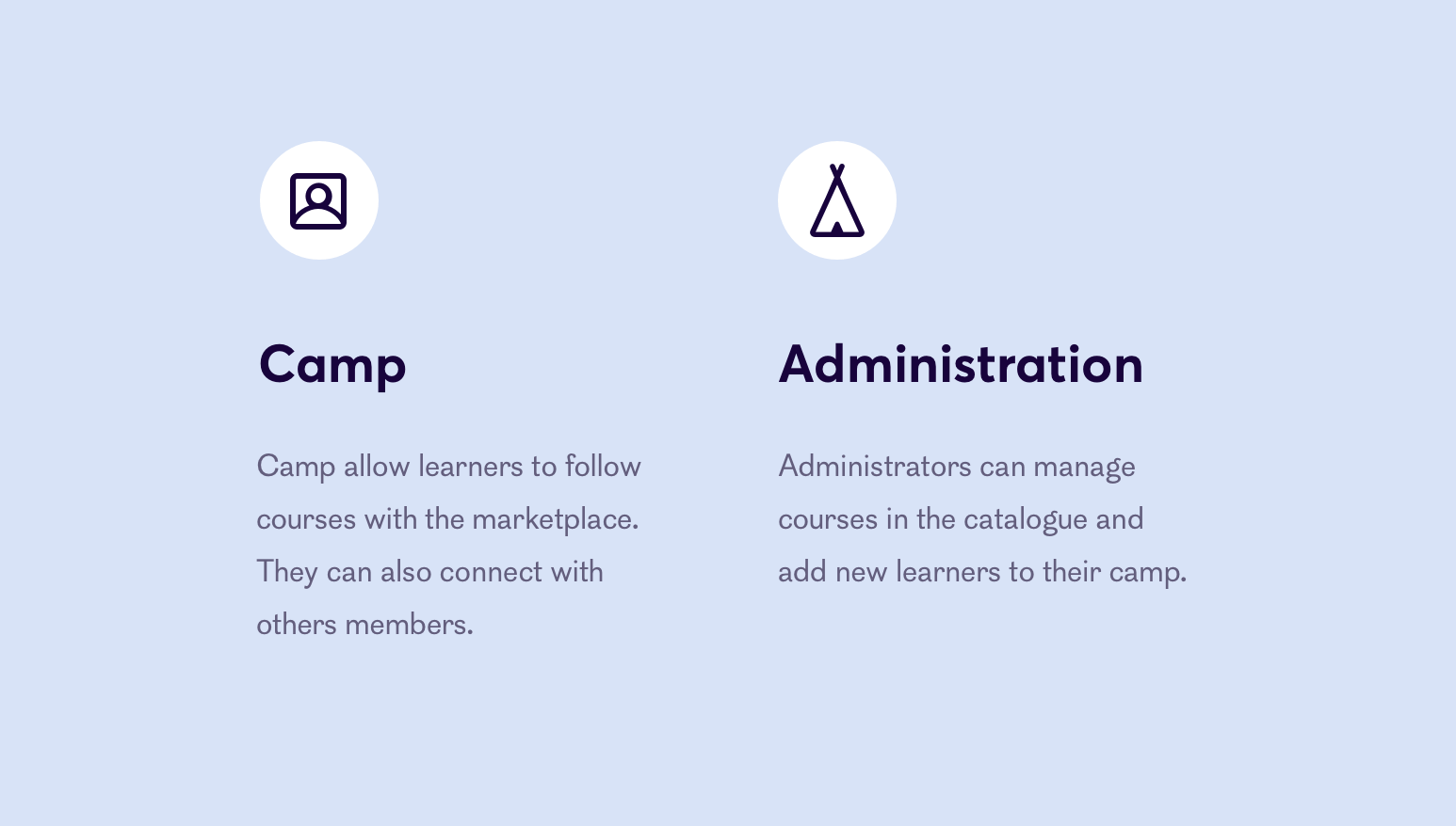
Working on the landing page gave me good knowledge to understand the target and the audience that was using the product. The challenge was to design a product used by managers and learners at the same time. The product is divided into two major parts:
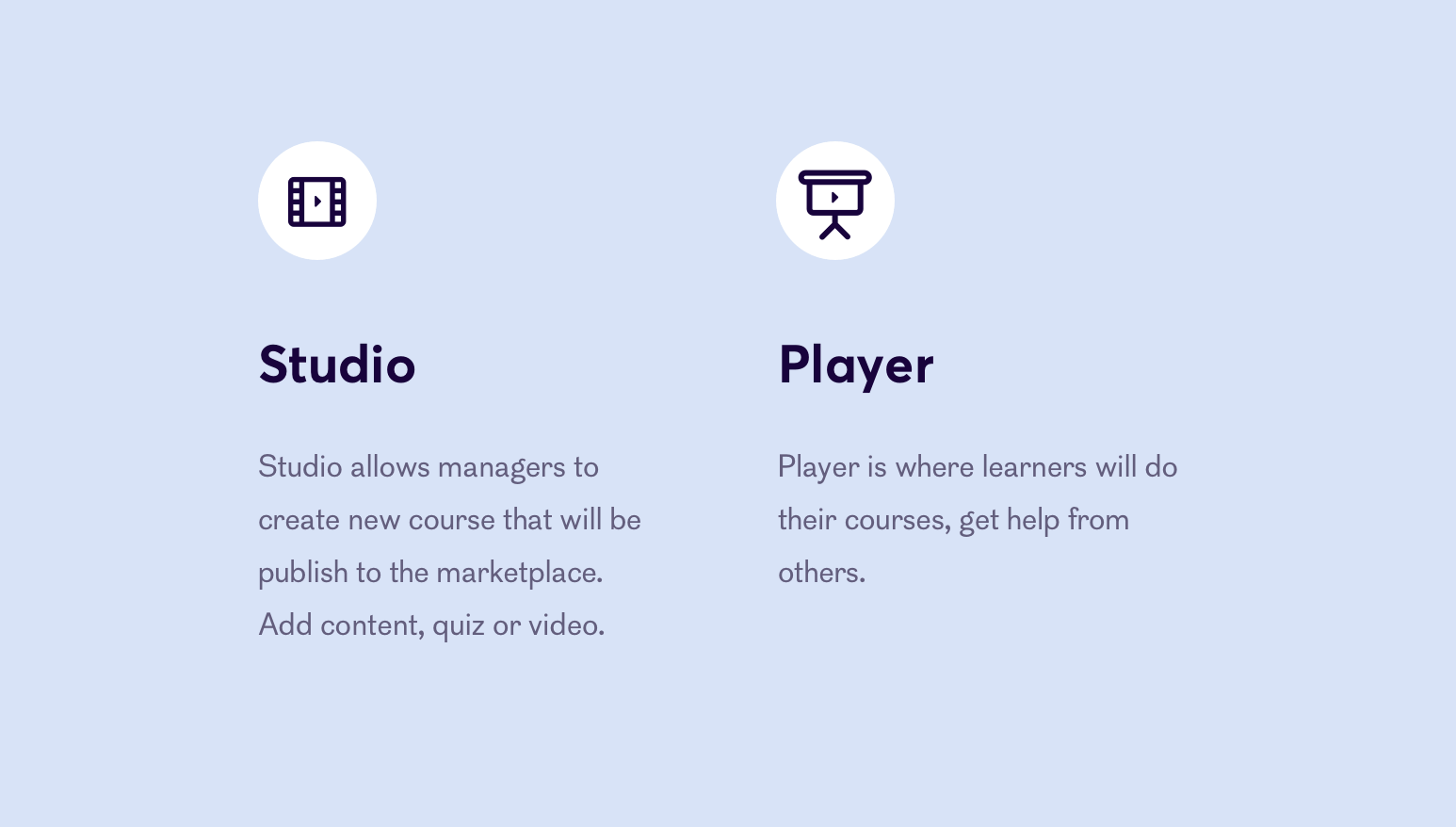
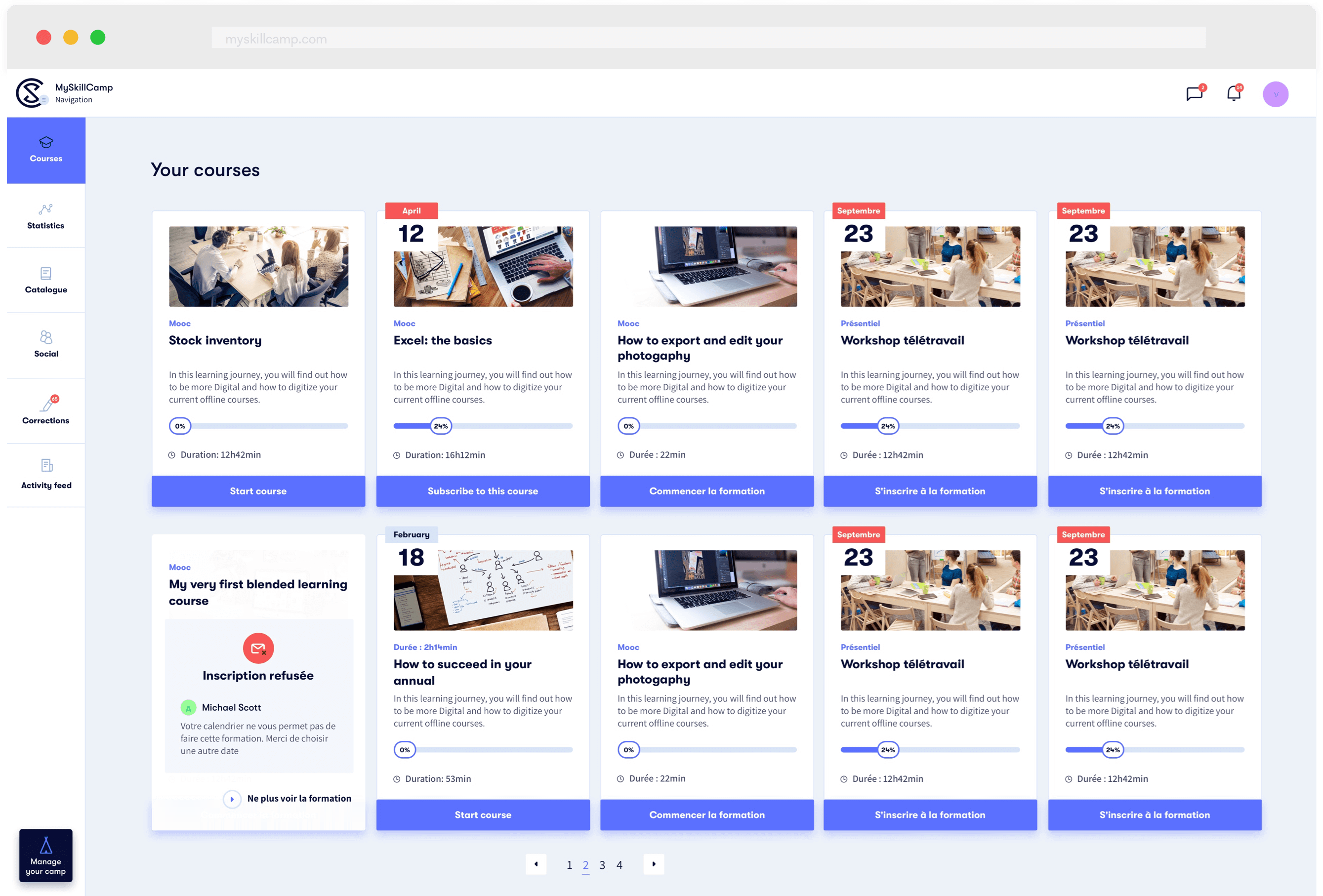
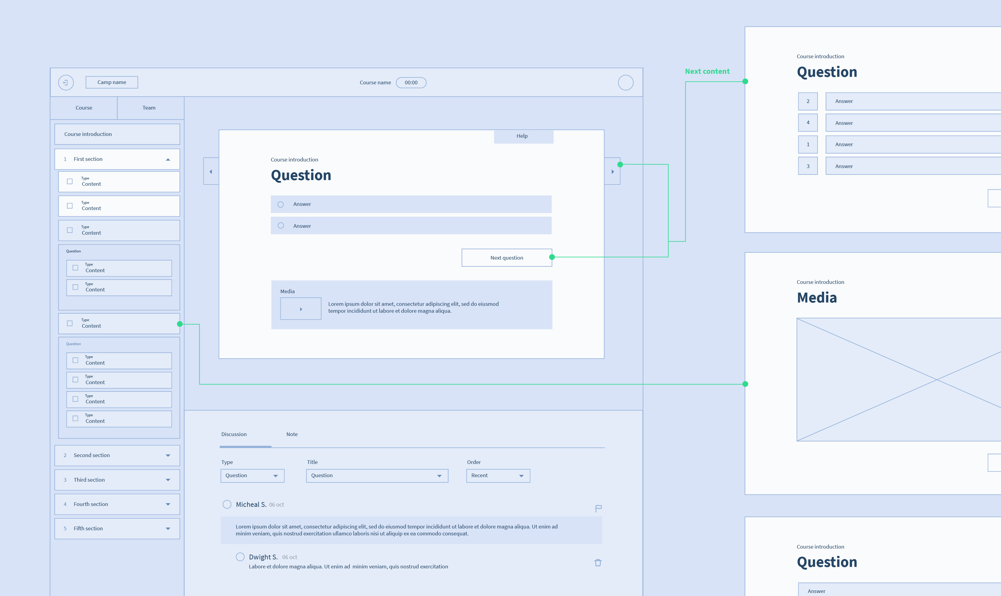
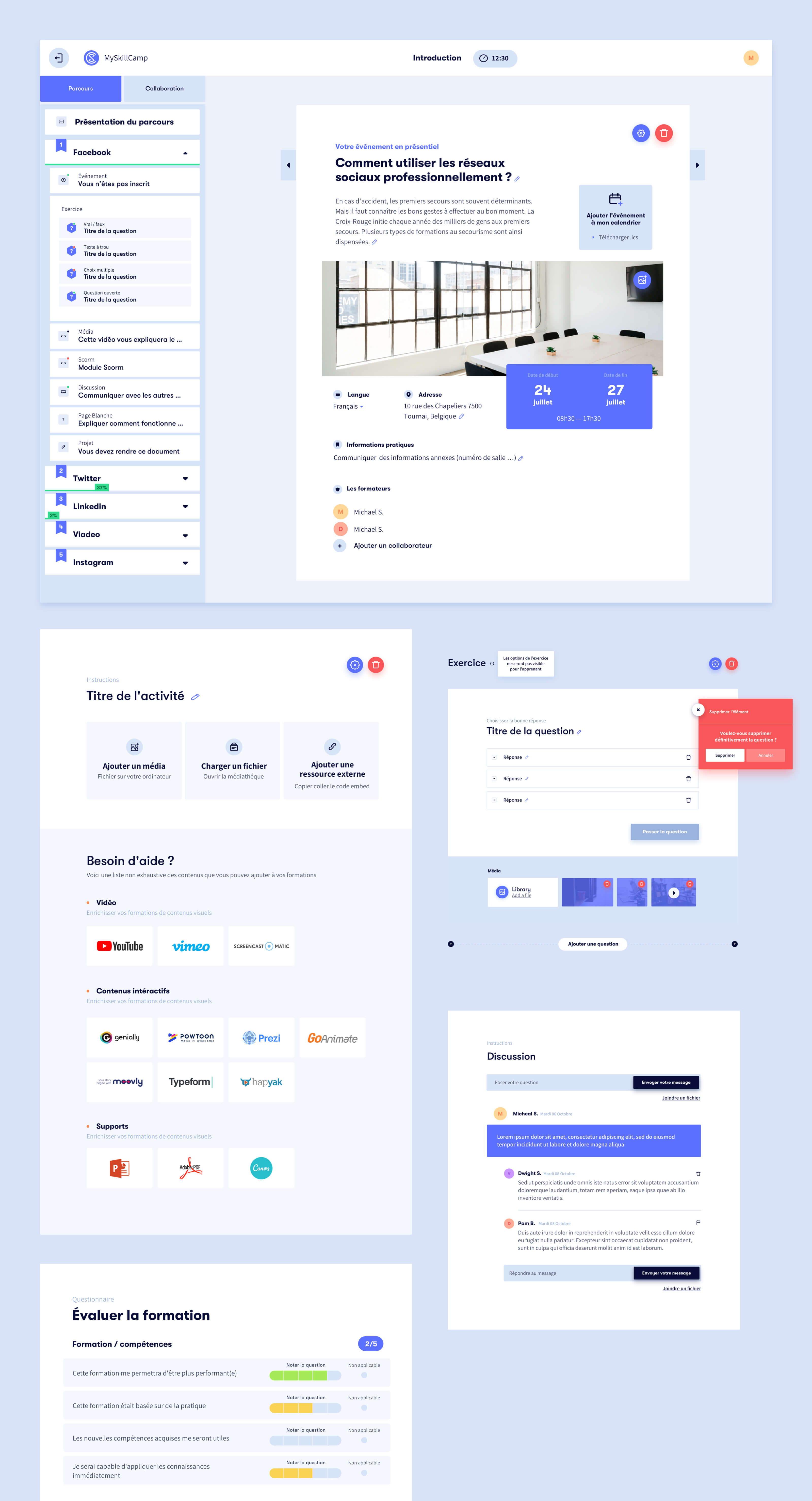
Our first focus was on the studio; the principal issue was for the learner to have a clear understanding of the structure of their course. Some elements were taking a lot of space, and the learner didn’t have a clear vision of what they were supposed to do.
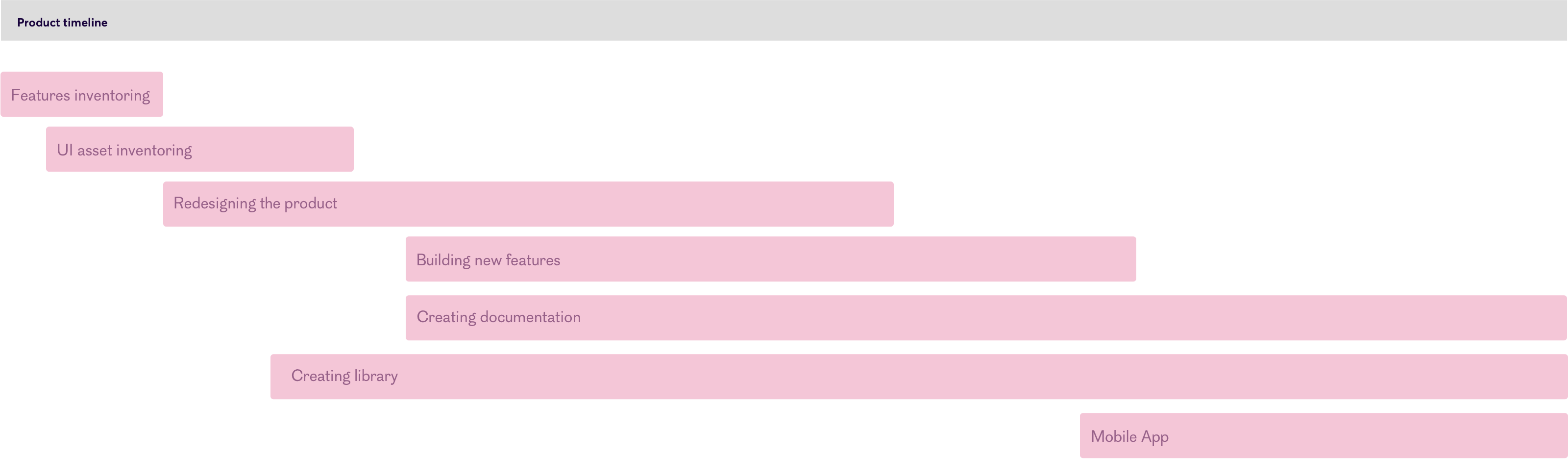
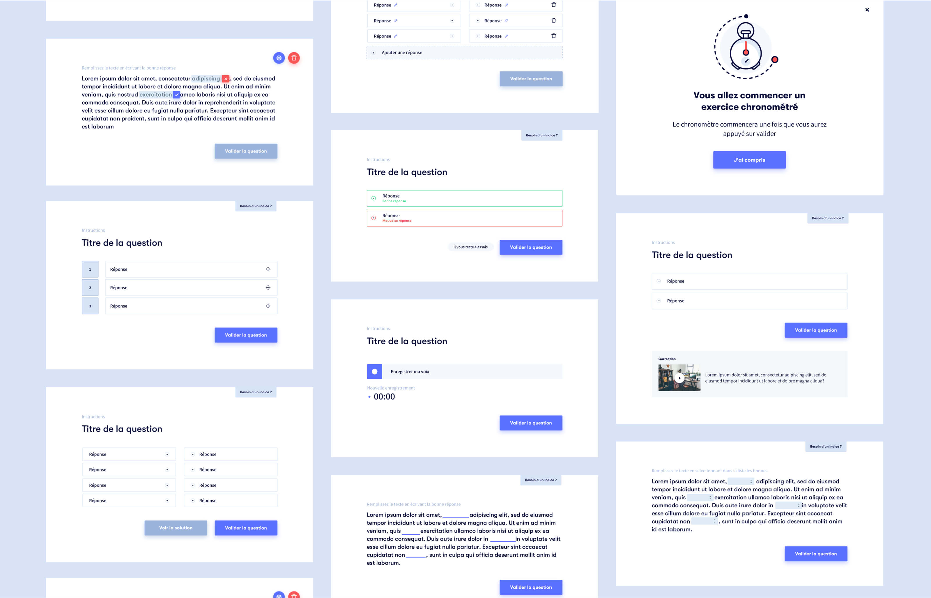
My first step was to determine where the main pain points of the product were and what was achievable in the timeline we had. I started my work by doing a complete inventory of what were the elements and features of the studio. From basic action for a learner to the type of content inside a course (quiz, videos, etc.).
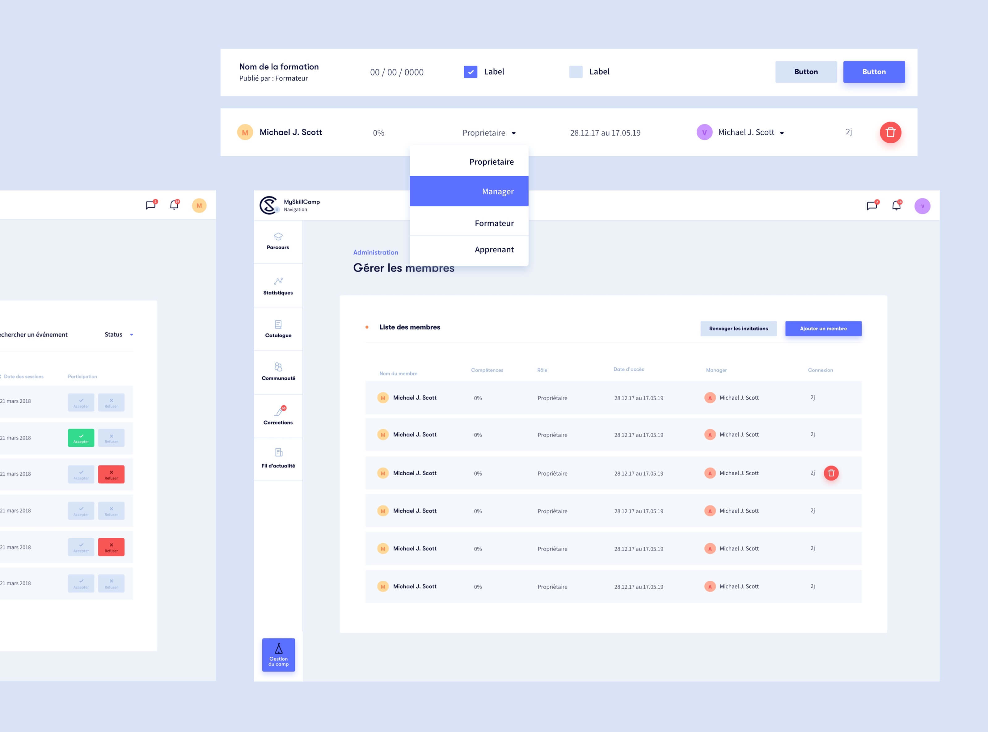
The goal was to reduce the friction users experienced and improve the product with new features. Learners had issues in following and understanding the course, managers were having trouble managing their leaners.
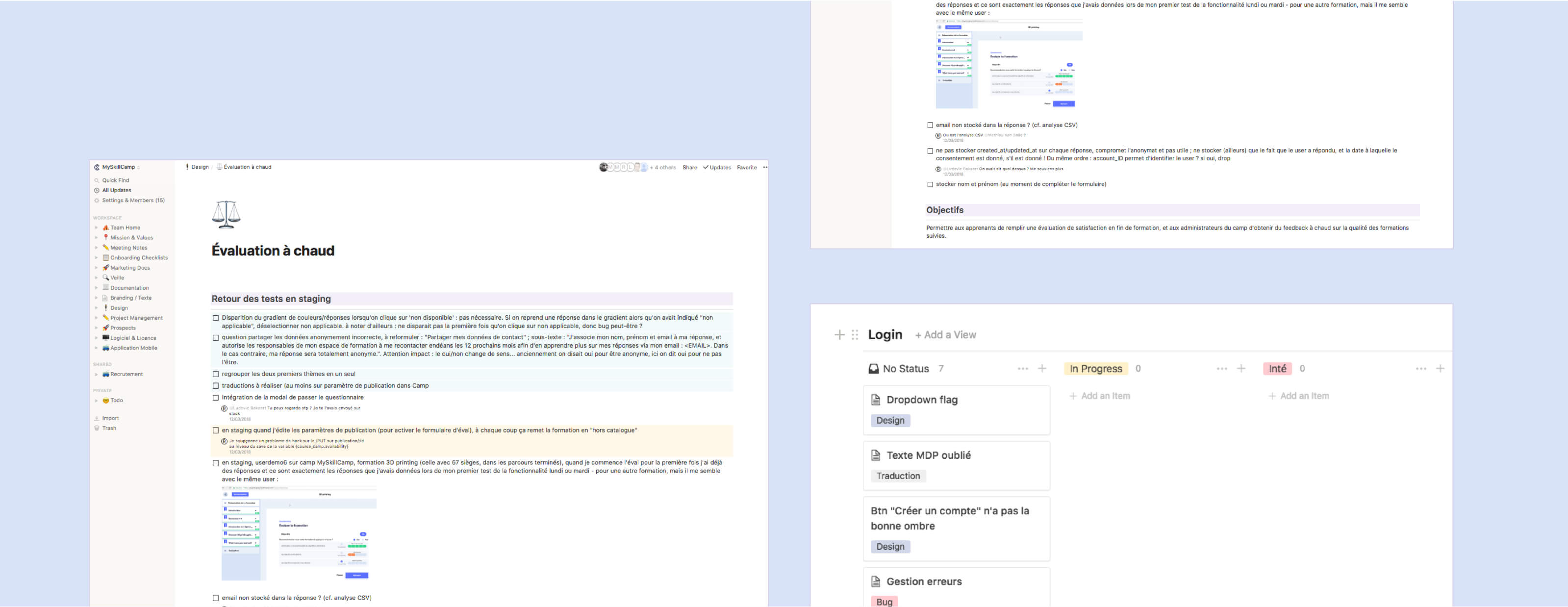
While we were redesigning the product, we had to add new features to the platform. Shipping features to the old platform and designing some new functionalities for the upcoming interface.
Creating a solid foundation for new colleagues to understand how the product works, helping us on decision-making, and creating processes were all the things we needed in this documentation, aside from the assets library.
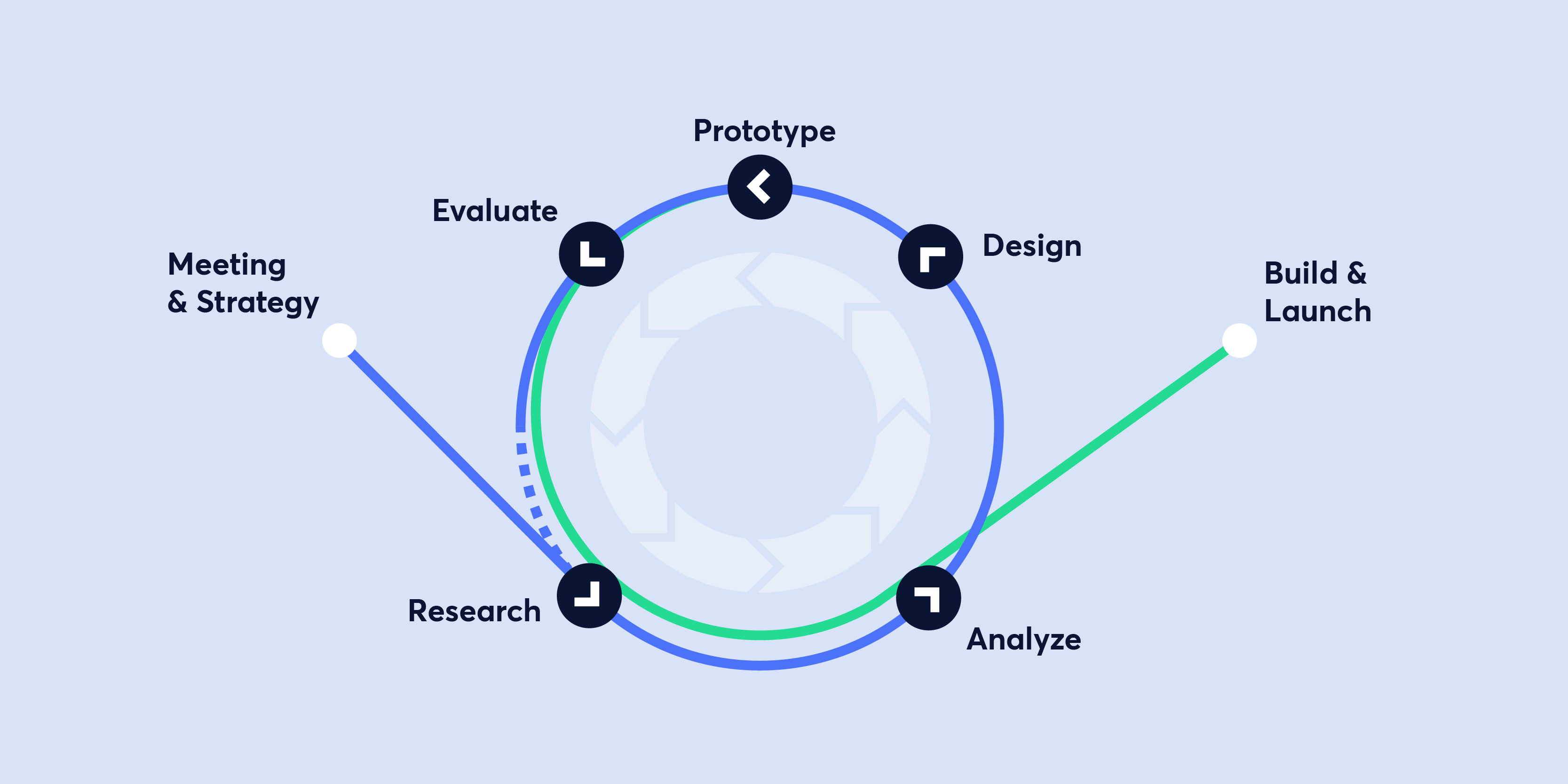
Since they already had a product redesign a year before, I took some time on the best approach to rebuild this product. I started by inventorying features, interface elements and interaction. I built a sitemap and created UX documents such as user stories to ease the communication between marketer, management and developers.
Working on a product sitemap allowed me to understand the goal of every page, which actions were linked and the most common way to perform an action.
Building user stories helps a lot during the whole process of creating new features, it also helps to communicate with other members of the team and the client.
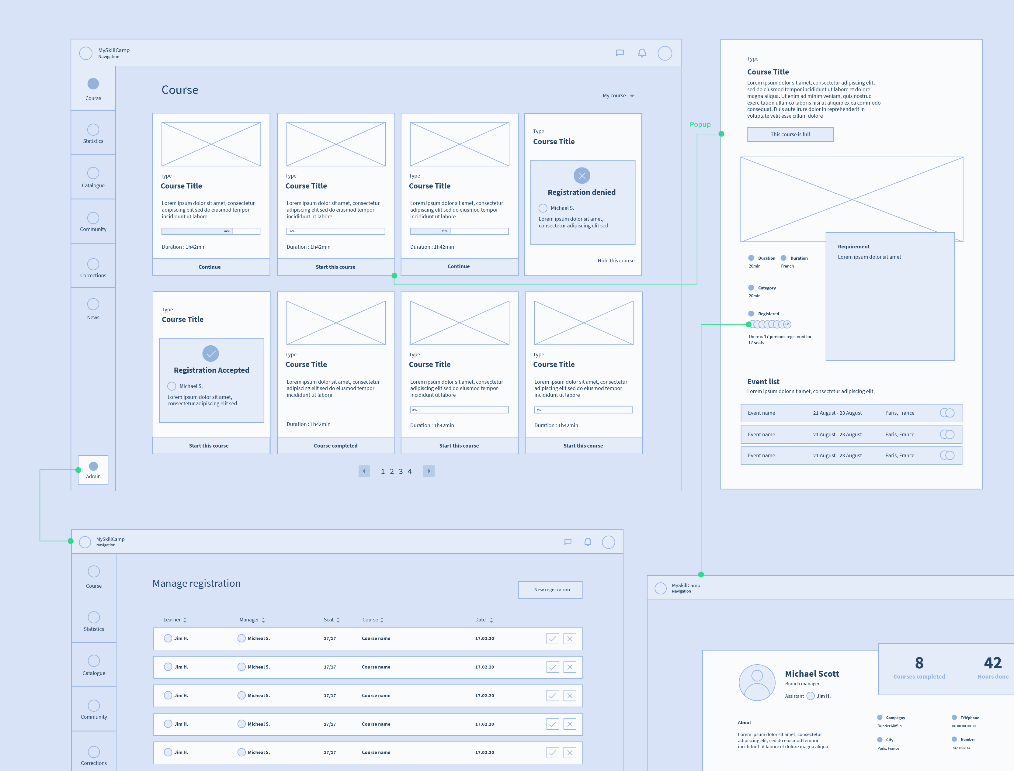
There were two main interfaces for the product, camp and studio. Camp is where is your course as a learner and your colleagues are. The studio is where you follow a course. One of the difficulties of designing the studio was to fit in a lot of interaction and content without disturbing the learner. We tried to have a main frame where all the course content is and a sidebar that allows you to navigate through the course.
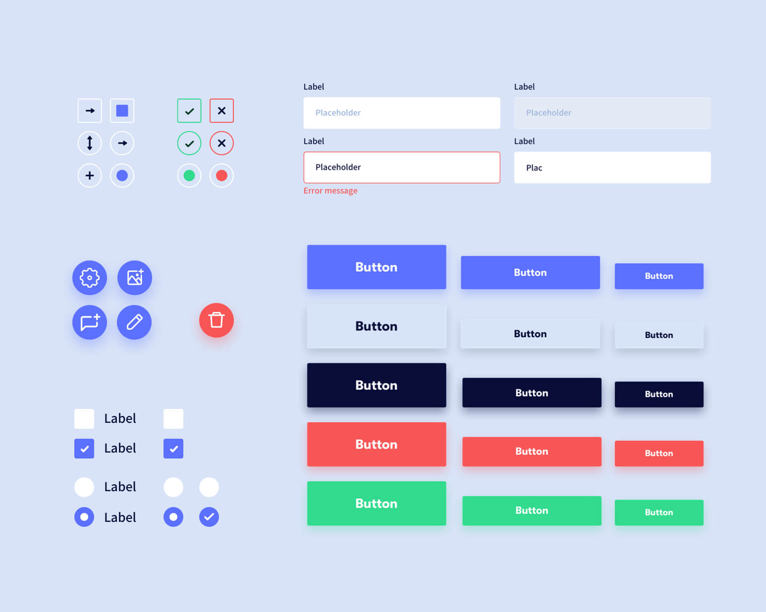
Cleaning and uniformising all the user interface elements was one of the goals, reducing the number and variations of elements. We needed to have a consistent identity with the landing page.
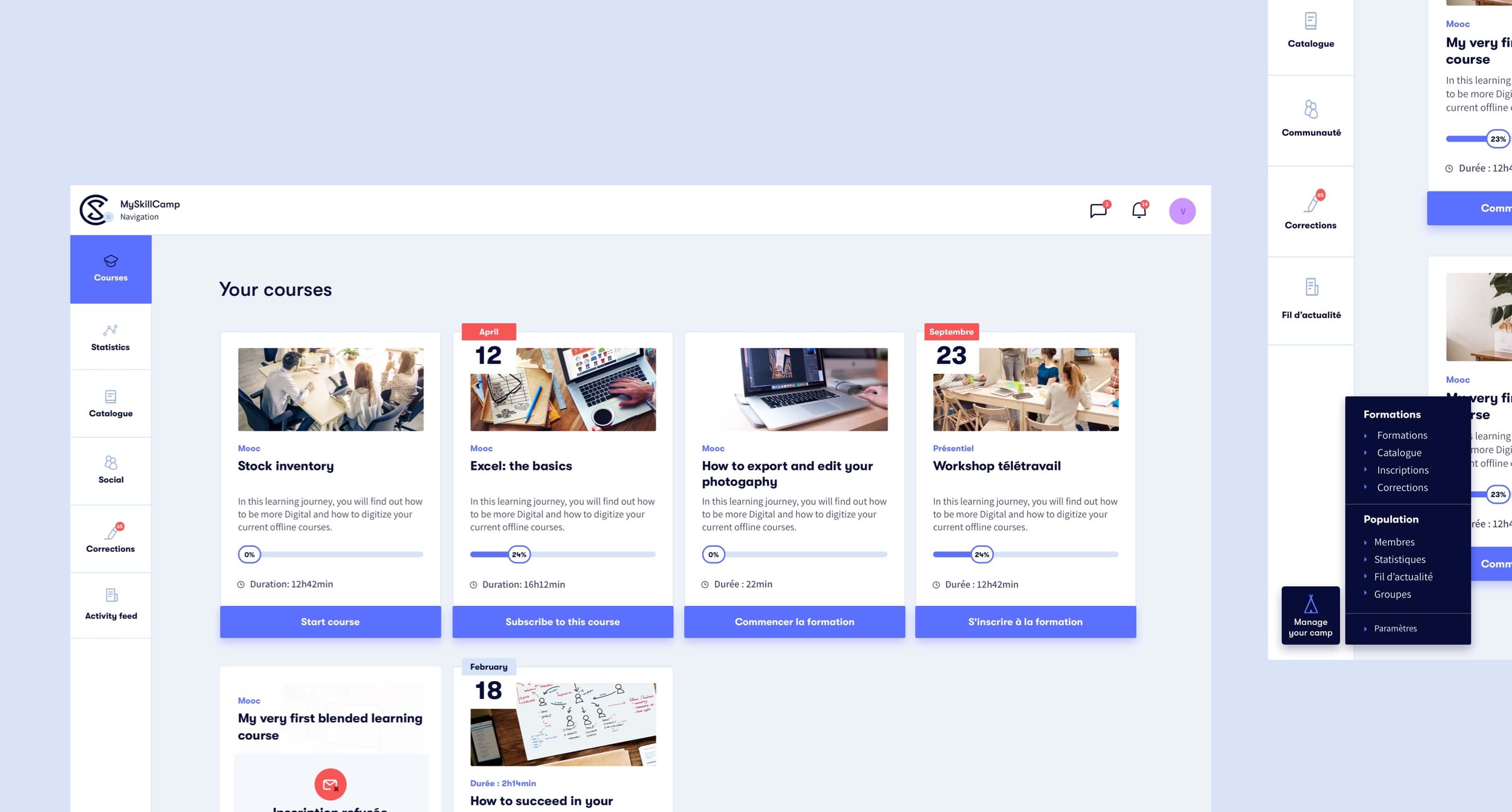
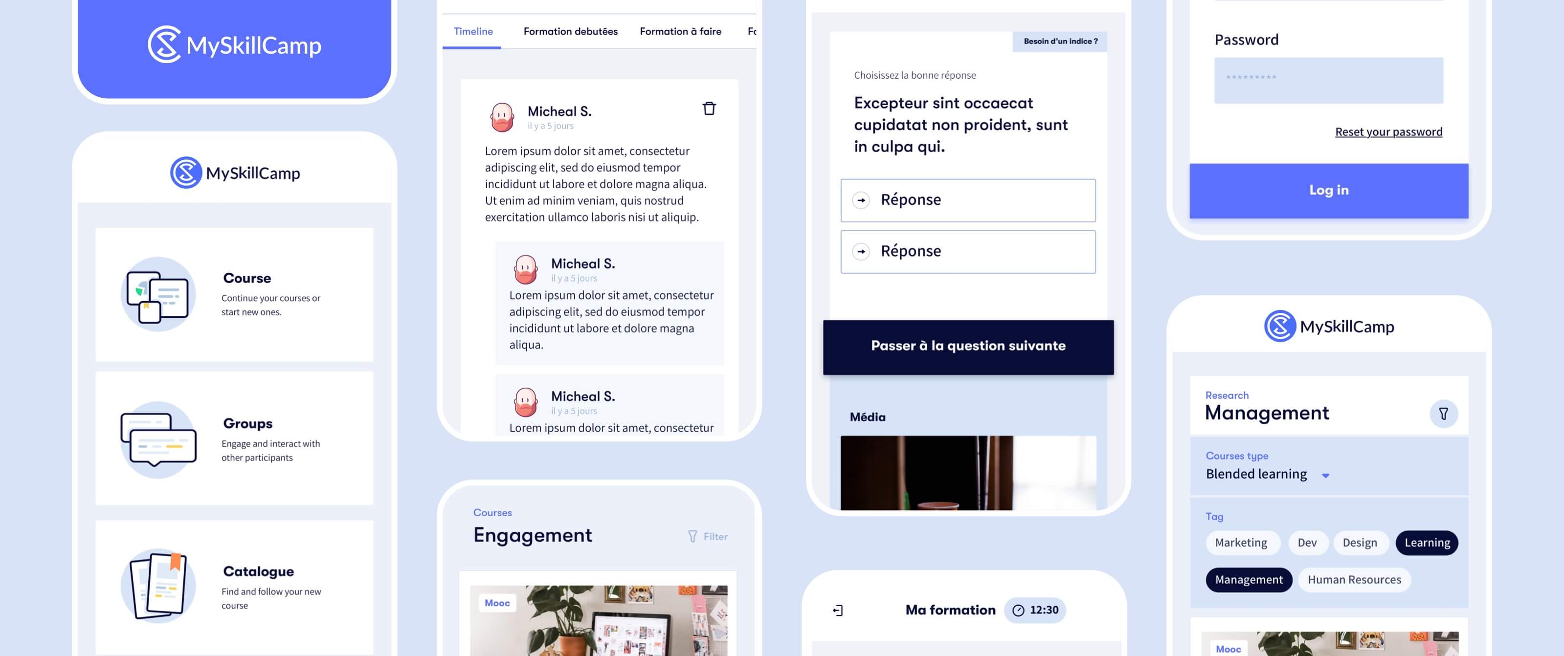
We extended the platform to a mobile application. Learners needed to have access to their course while being on-site, or so they could pursue their learning while travelling for work. On the mobile app, you were only able to follow a course.
In addition to dealing with shipping features on the old platform for a couple of months, one of the challenges was to create a process of creating new features, from understanding the client’s needs to creating the documentation so everybody would be aware of the questioning behind the decisions.
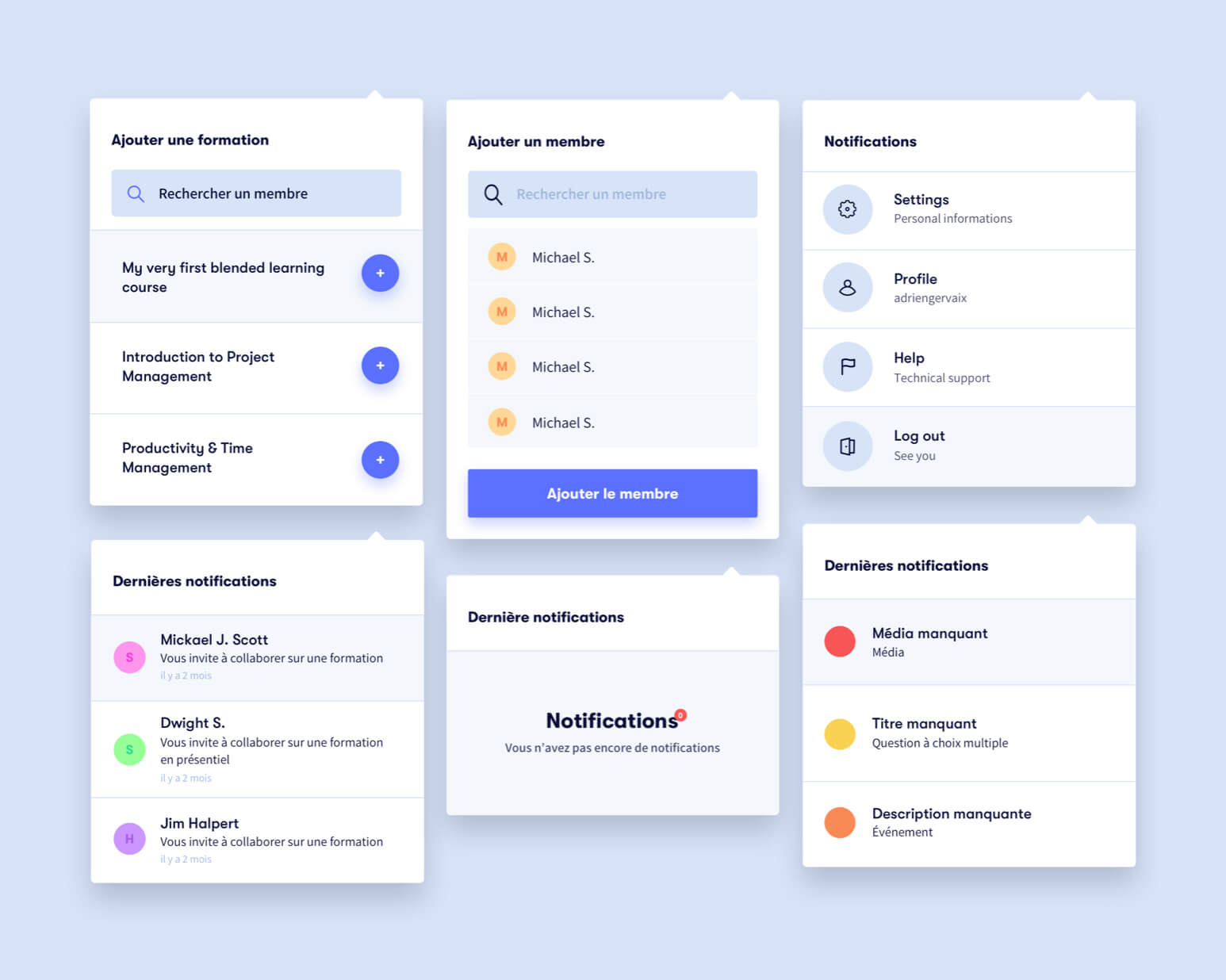
Alongside with redesigning the product and building documentation, I helped to create several new features such as:
Allowing learners to rate a course with a questionnaire at the end of it
Connecting people inside the platform to exchange knowledge
Creating a page summarising the activity and news for the learner
Helping a new learner or manager to understand the platform
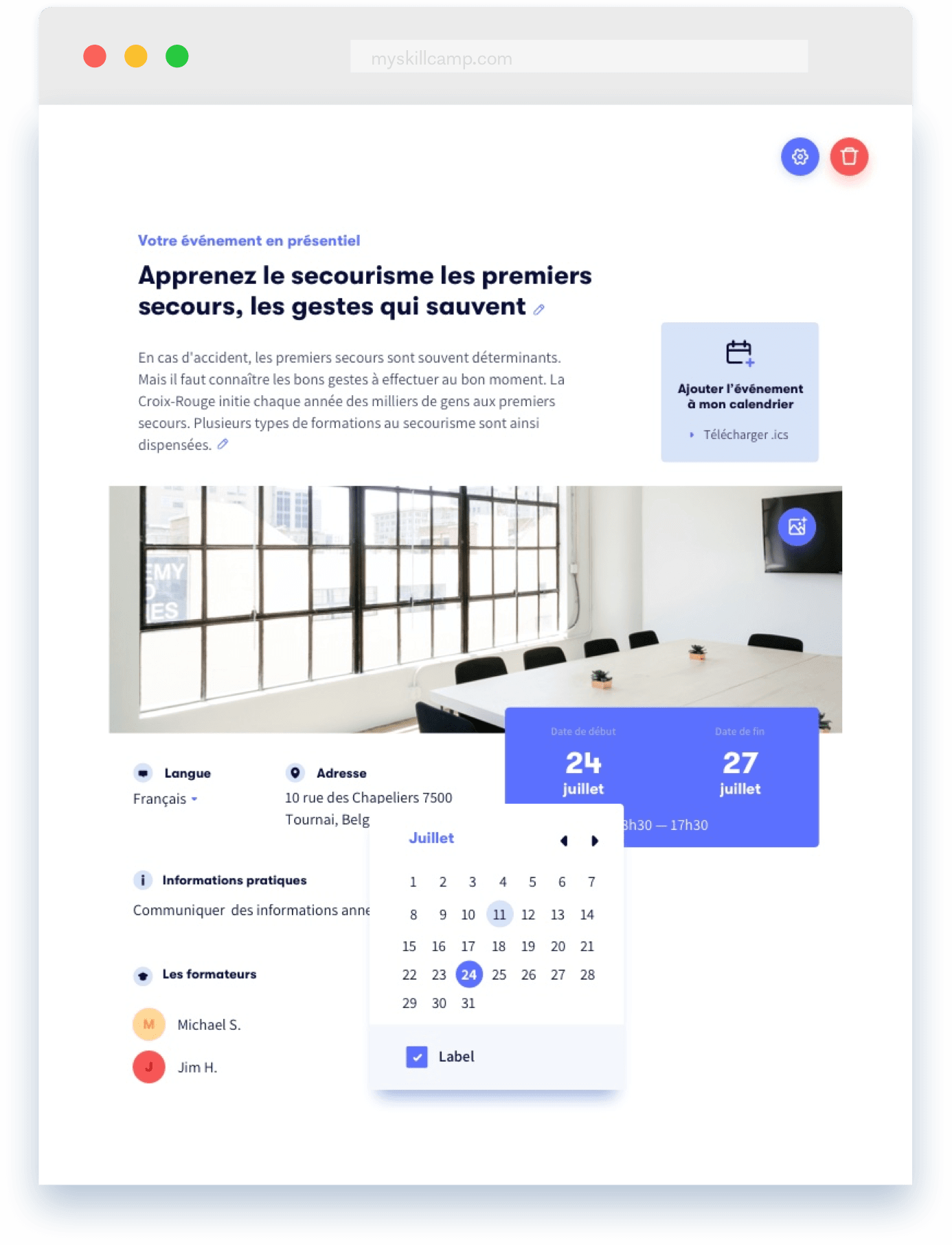
Adding an event element to a course to create an on-site event
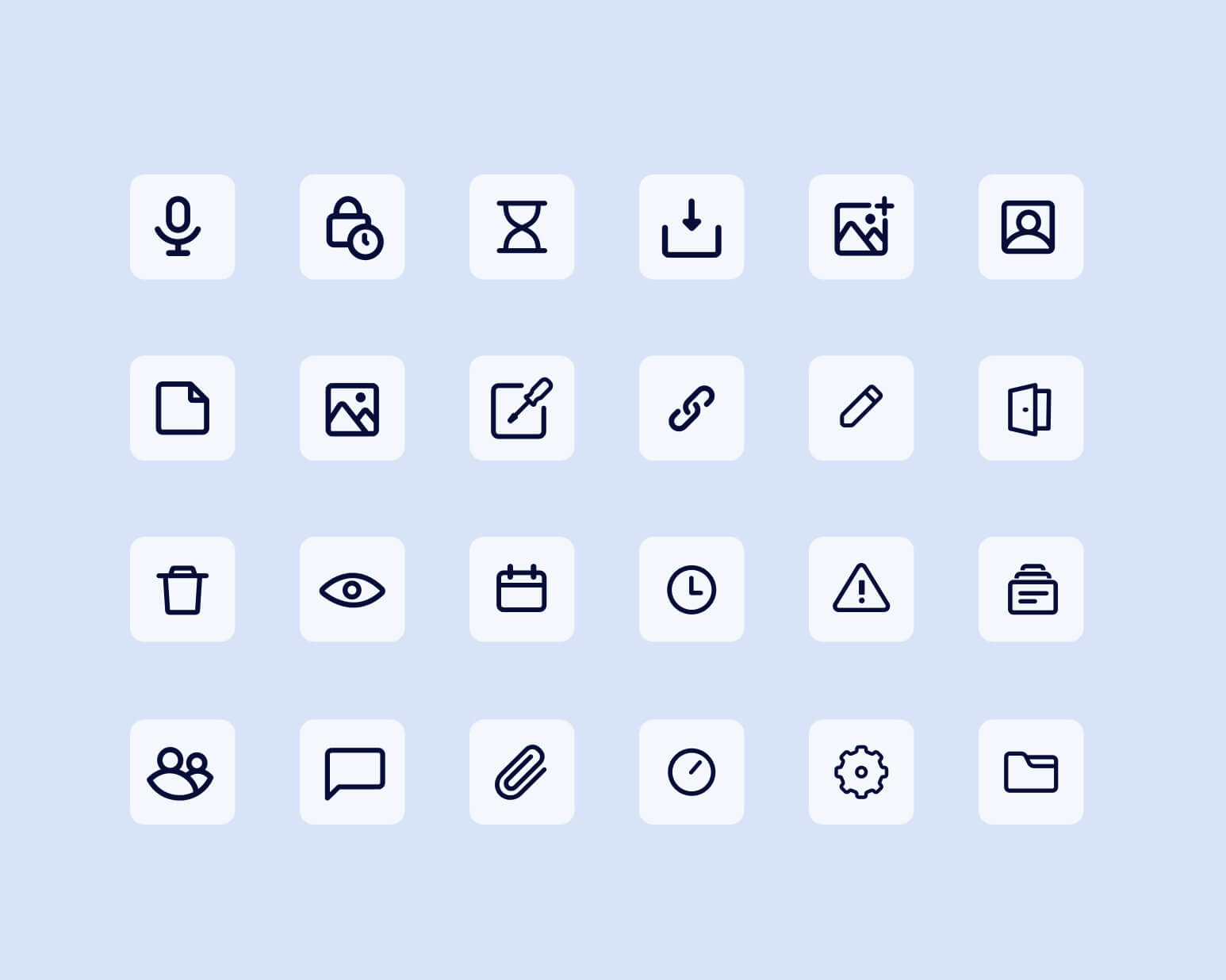
After some time working on the product, I decided as part of the mission to build the documentation and design system. It would help me to communicate, ease the process of producing features and uniformise all the assets in the product. We mostly needed a place where we could put all the knowledge and thinking when we were working on new features.
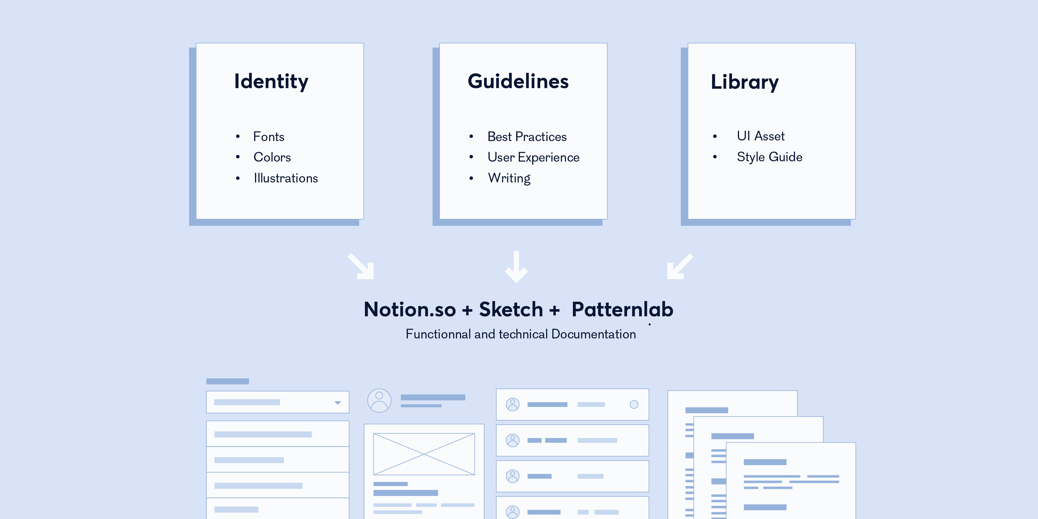
Creating an asset library with Sketch was a challenge. Thinking about how to organise your work for the next designer was a tough task when you are the sole designer on the team, so I tried to match how the development team was working.
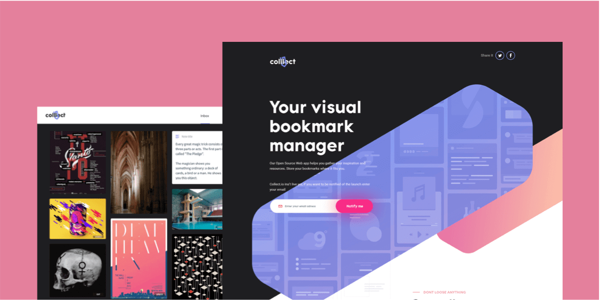
The other project was to created a new identity and website which was more align with their vision.
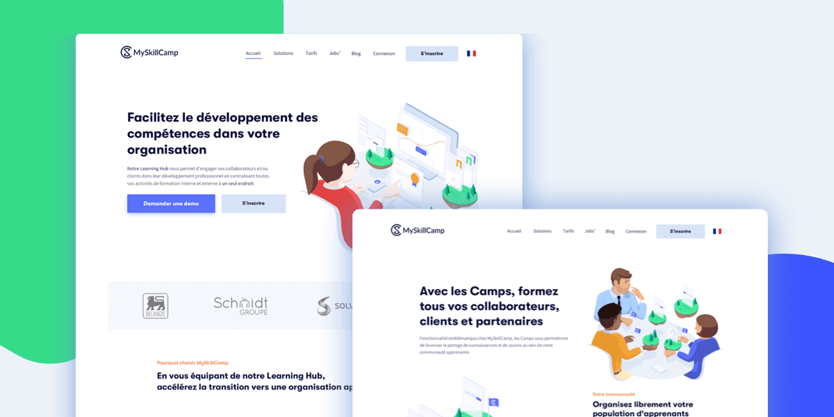
The journey of designing my first side project, creating the product and landing page with new experimentation.